Project Overview:
The objective of this concept project was to take an existing brand and redesign its logo, font selection, color palette, style guide, and three deliverables of our choice. I designed a minizine, a poster series, and a series of social media posts for Facebook and Instagram.
Timeline: February - March 2022
Responsibilities: Solo project, I handled everything from the logo creation to the style guide and deliverables.
Challenge:
The challenge or prompt for this project was "How might we increase donations to your non-profit?". I challenged myself to elevate the Prairie Paws Animal Shelter brand, in hopes that it would bring in more donations.

Key Motivators:
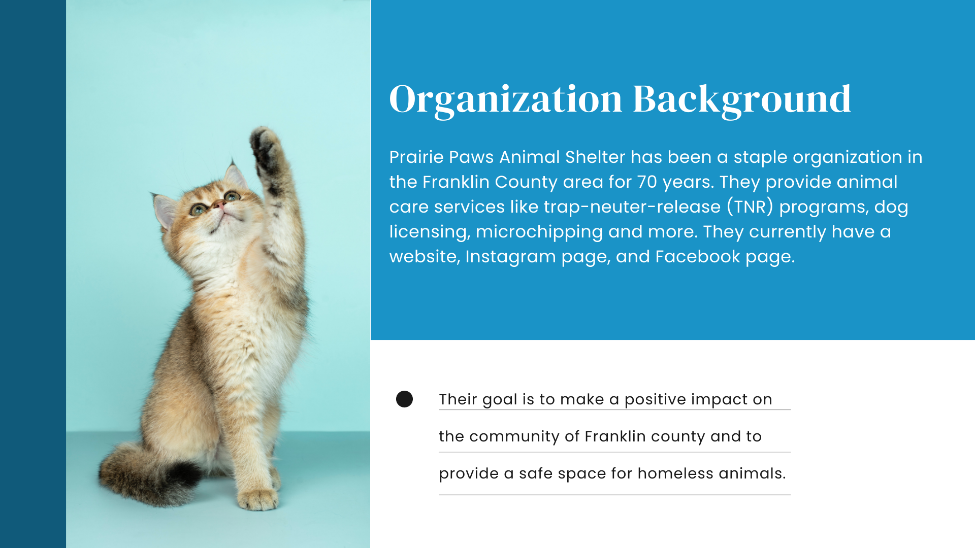
Prairie Paws Animal Shelter is a local organization, they are a non-profit that runs off of grants and donations. The goal of this concept project is to create a brand that sponsors and donors are interested in spending their time and money to support. Highlighting all of the good that Prairie Paws does for Franklin County while giving them a new look and voice.

Research:
The first few days of this concept project were focused on research. This included a deep dive into their current website and social pages. From this research, I was able to get an idea of what their brand voice is currently, and where I thought I could improve the brand. Other than the basic recon, I also took this time to do a competitive analysis of other Animal Shelters in the area, what their brands looked like, and if I could see any trends within the animal shelter community.
Overall, this research led me to these insights: Logos are minimalist and often have imagery of animals, and the brand colors tend to be bright and inviting, often containing a shade of blue, and Prairie Paws as it is currently has a family-oriented tone-of-voice - the community has a huge impact on their operations, they rely on donations to help fund larger projects, and they often have a very genuine and open line of communication with their patrons.
From the research stage, I moved into my next step of sketching out and finalizing a logo and color palette for the brand.
Logo Design:
At the start of the logo design process, I wanted to make something simple and minimalist, a lot of the animal shelters saw during the research stage had very simple logos. I noticed quickly that the minimalist feel wasn't the direction I wanted to take Prairie paws. I realized quickly that I wanted to incorporate aspects of the prairie plants into the Prairie Paws logo. Their current logo is a text logo with a few shocks of what appear to be wheat within it. I wanted to take this to the next level and make it a logo that stands out while staying true to the client. After many iterations, I settled on a sunflower with animal silhouettes inside the center with the organization's name a the bottom.
Typography:
While working on the logo, I had to also start thinking about the font pairings that I was going to use. Prairie Paws currently uses a combination of a handwriting display font and a serif font in their logo, and for headings, they use a serif display font and a sans-serif for paragraph text. The serif displays are different, so there is little consistency within the display fonts they are using.
I wanted to update the typography by giving them a display font that was fun and playful - I had to match that font as closely as I could for secondary headings and sub-headings, with a rounded serif font for paragraph text.
Color Palette:
Prairie Paws' current color pallet consists of Purple and dark green. Great colors complement each other well, but compared to other organizations it is dull. I felt like a monochrome color palette of blues ranging from dark blue to light and bright blue was ideal. Blue is often seen as friendly, inviting, and calm - all of which is exactly what you want to feel as you are entering an animal shelter to find your next and newest family member.
The darker colors will be the primary colors used in the brand - they are easier to use and pass accessibility standards more often than the lighter shades, but the light shades make great accents and add an extra pop of color throughout deliverables.
Style Guide:
The style guide was a work in progress throughout the project timeline. The first thing I focused on within the style guide was the mood board and trying to find images that speak to the brand voice I wanted to convey. When someone goes to an animal shelter they are looking to find the next new member of their family. Once I finalized the mood board and the imagery I thought fit the tone and direction I was taking the brand, I began to piece together the remaining pieces. I looked to other brands' style guides for inspiration. Through this process, I was able to keep myself on track and keep the work flowing.
Minizine:
The Minizine is an 8-page "magazine" that contains information about Prairie Paws Animal Shelter. I chose to do the minizine because it could be used to welcome new Franklin County residents, or as a monthly newsletter for subscribers. I used a mixture of historic information about Prairie Paws, and the imagery I used for the mood board.
Poster Series:
This poster series was used to highlight the Tennis Ball Run, which is an event that Prairie Paws holds to raise money for their organization.
Social Media Posts:
I wanted to make these social posts fun, and entertaining, a lot of their social media posts are set to more melancholy tones, and I want to keep them light, fun, and easy-going. This way it will bring in the younger generations, and makes them appear more family-friendly.
Key Takeaways:
From this project, I learned that having a style guide is important to keep you on track. It helps give you a starting point and a guide to keep your designs cohesive. This project also helped me gain confidence in my ability to design, and was a great starting point for the next portions of our course. It is important to have a plan going into a project like this and keep your client's needs and wants in mind as you move forward and into the final stages of the rebranding process.